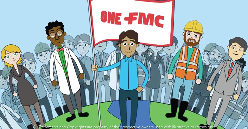
We selected a specific video of a safety enterprise, that defined a new logo to introduce meaning of new internal safety program. This video was distributed to 6,500 employees globally and was accompanied by transcripts translated into the top nine most common languages spoken by employees.
The new logotype, meets the objective of telling the employees “to be safe, we must always think safe”. Seek that efforts to improve the image of our brands, have a clear intention of the perception we want to transmit. The brands function as a family, if all the family members feel comfortable they’ll project it to the outside. If the employees feel at home they’ll do better their work.
This is a great example of how a rebrand strategy may improve the perception of your company. Colors, communication and even all the actions you start for your campaign, will make your brand’s perception increase the loyalty of your people.
Check out the results in the next video:

