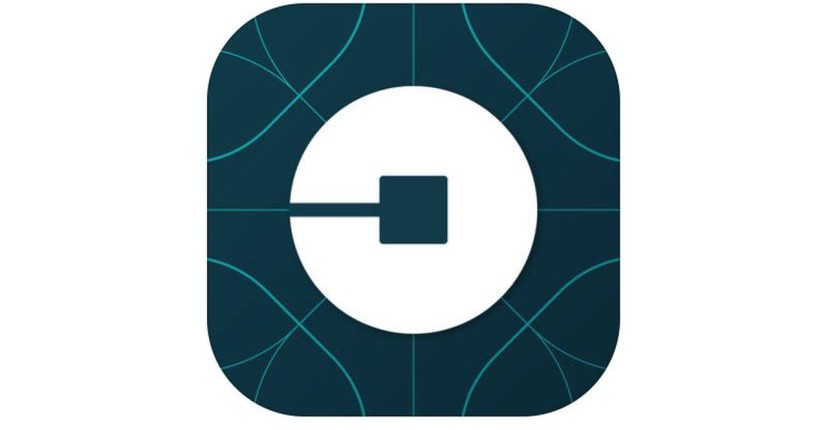
The great mobility brand, Uber, revealed yesterday its new logo, which you can see if you update your mobile app. The “U” logo is gone, what you can appreciate is an “attempt” of circle. The company describes its logo as a design that would help them to add additional products to its portfolio in the near future.
In fact, the center of the new logo is a “bit”, and what they are willing to create, is a visual concept that the customers may easily identify. Travis Kalanick, CEO of the company, says that the new branding “celebrates” the Uber’s technology, and the new logo is the product of teamwork, analysis and effort: “the team has spent months researching architecture, textiles scenery, art, fashion, people and more to come up with authentic identities for the countries where Uber operates”, he said.
Uber’s redesign is based in inspiration, is telling a story behind the work they do and the people they serve; is the story of bits and atoms”: “with the potential for many apps with many app icons, we needed one approach that connected them all. So we came back to our story of bits and atoms. You’ll see that both rider and driver icons have the bit at the center, and then the local colors and patterns in the background. This is a framework that will also make it easy to develop different icons for new products over time”, emphasized Kalanick.
It seems that the company was likely expecting a little more love from the crowd when they unveiled its new logo, but instead, the event created controversy in social media, (at least).
The truth is that Kalanick spent at least three years working with the design director Shalim Amin, and about a dozen people created the new look, “I just knew it was important, so I wanted it to be good”, said Kalanick to The Verge.
If you want to meet the full story and the origins of this redesign, click here.

