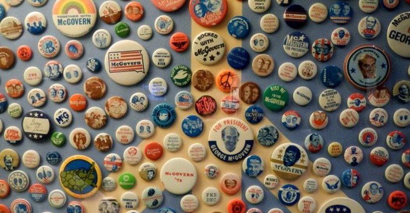
From the 1700’s to the 1800’s, posters and political cartoon engravings were the mainly used ones as elements of political campaigns. At the time of George Washington, campaigns started using political buttons that were showed in their clothing. But giving away promotional freebies isn’t new, at least, that is what the book Presidential Campaign posters –sold in 2012- says: this practice dates back to 1828.
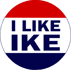 Years started passing by, and the political campaigns started becoming a branding strategy instead of a “self promotion” process. A breakthrough took place with the photographic tintype that was used in Abraham Lincoln’s campaign pin. After that, advances in lithographic printing let political buttons ad slogans such as “I Like Ike”, showed in the Dwight Eisenhower’s campaign button.
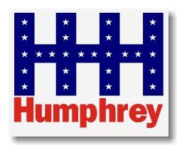
Peculiarly, the creation of candidate logos, is a new development, and it marks the transition of campaign slogans to personal branding quotes. This shift from type logo began in the middle of 60’s, with the LBJ USA map logo and Hubert Humphrey’s HHH symbol.
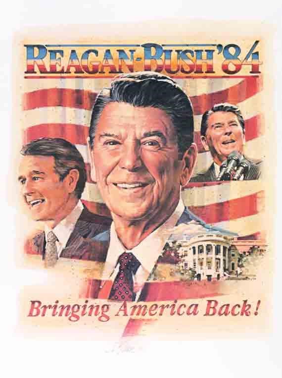 From the 70’s to the 80’s, this practice entered into a transition, candidate logos had a disco-era feel. In the mid of 80’s, Reagan-Bush promoted himself with a retro flag logo that showed the slogan “Bringing America Back”, which had the purpose of gaining followers.
To be effective, a candidate’s logo needs to send a message of service and unification, in order to mobilize the candidate’s voting block.
 Designers agree that in Obama’s campaign has the circle is that is a perfect geometric form and symbolically its shape represents harmony and unity, and also the natural elements earth and sun. With this considerations, the design firm Sender, decided to turn the “O” into an iconic and patriotic seal.
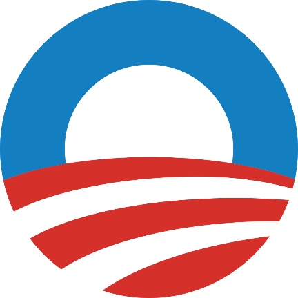
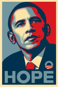
At the time, the pop art “HOPE”, created by Shepard Fairey (with this in mind, the design firm Sender translated the “O” into an iconic, optimistic and patriotic seal. At the same time, the pop art Hope poster by street artist Shepard Fairey.
Nowadays, Obama’s logo is so effective because it demonstrates the three principles of a successful logo: The form, which means “essence of personality”, the mark, which is memorable, and the colors that evoke emotional response.
Article information via: newbostonpost.com
You must be logged in to post a comment.