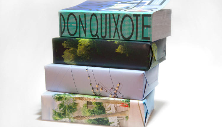
The four hundred year-old experimental novel, Miguel de Cervantes’ “Don Quixote” is one of the most finest novels ever written, this is why Visual Edition decided to relaunch a new mega-volume of a beautifully version of this book with a different graphic design.
This totally fascinating version of “Don Quixote” uses design to explore the nature of the original text.
Visual Edition decided to play with the graphics to reflect how the main character sees the world. A great example of the use of creativity, is when the main character is fighting with windmills, he thinks they are giants; so when the reader reaches this part of the novel, he may experience emotions through the reading.
With this improvement Don Quixote becomes a surprisingly modern-feeling book that reflects the freshness.
This is a clear example of how graphic design improves a classic novel, to take the reader to the next level, it helps him to feel each moment of the main character and the places he is located.
This graphic design makeover was designed by Fraser Muggeridge.
Via: Fastcodesign.com

